Workshops
June 5-6, 2019
| VecchiaStamperia | Bruno Maag & Richard Bailey | Lila Symons | Monica Dengo |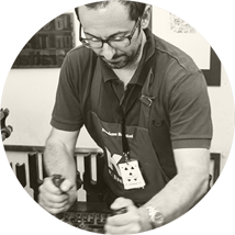
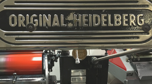
Damiano Bandini loves letterpress, and movable types. This is why he still runs an old letterpress workshop in downtown Faenza, carrying on passion and knowledge handed down from father to son.
La Vecchia Stamperia is a historic workshop (Bottega Storica dell’Emilia Romagna): everything started in 1920, so this workshop has been printing movable types on paper for more than 90 years – and counting.
He has got one of the largest collection in use, of very rare metal block-prints and unique artistic wood ones.
Did you buy a Heidelberg Windmill — or “Stella”, as we lovely call it in Italy — and all you need is love… sorry, experience to become a professional letterpress printer? Join us in Faenza and Damiano Bandini will share a lot of secrets with you!
You’re a proud owner of a Heidelberg Stella, and you’re going to become a professional printer, we know! Or you'll try, at least…
Will you mainly print texts composed with a lead type or will you also use a lot of images? And what about cliché and xylography? You have to prepare your Stella in different ways, starting with the right packing. Set the preparation the wrong way, and you’ll have more than some troubles.
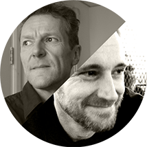
Bruno began his career with an apprenticeship as a typesetter at Tages-Anzeiger, Switzerlands largest daily newspaper. He then studied Typography and Visual Communcations at Basel School of Design under Wolfgang Weingart and Andre Gürtler amongst others. After graduating Bruno emigrated to England to work for Monotype where he established their ‘custom type department’, creating fonts for the New Yorker magazine, and others.
Richard’s background is in corporate services, but since joining Dalton Maag he’s diversified into developing the design service offering and improving the client experience.
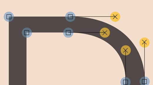
Two day workshop on a professional approach to designing a typeface.
In the workshop Richard Bailey and Bruno Maag will explain an effective and efficient approach to designing a typeface (family). The participants will learn how to define the requirements, aesthetically, technically, linguistically, and how to setup the design process.

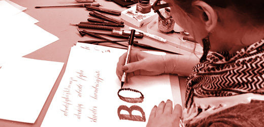
Lila Symons is a multidisciplinary typeface designer and lettering artist who specializes in the design and engineering of fonts for consumer goods and lifestyle brands. She works as a font developer for Hallmark Cards in Kansas City, Missouri where she creates proprietary typefaces based on handwriting, calligraphy, and lettering.
A trained photographer, Rainer Erich (‘Eric’) Scheichelbauer (b. 1977 in Vienna, Austria) holds both a philosophy and a Dutch studies degree. He creates typefaces, works as a digital punchcutter for other type designers, and gives type design workshops on a regular basis.
Two-day workshop to learn to design a script typeface.
Start a font project with renowned lettering artist and type designer Lila Symons. You will learn how to:
- look at your lettering and sketches and see if they will work as a font,
- turn your sketches into clean, working outlines,
- learn how to use vector autotracing the right way to create fonts with texture,
- learn what letters to draw in glyphs so you can connect and space all your letters well,
- apply optical corrections,
- develop your drawings into a working font,
- create basic alternates for your letters,
- create OpenType features for making sure the right letter variants appear in the right positions,
- test and improve your design,
- … and many more details of the type design process.
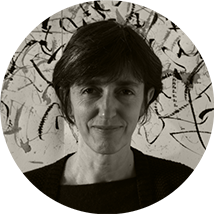
Monica Dengo was born in Italy in 1966. In 1993 she moved to San Francisco (California) and in 2001 she acquired dual citizenship, Italian and American. Currently she lives in Arezzo, Italy.
Monica began the study of graphic design in Venice, Italy and England. In London she studied calligraphy and bookbinding at the Roehampton Institute (1991-1992) with Gaynor Goffe and Ewan Clayton. In 1993 she moved to San Francisco (California) and spent three years studying independently full time manuscript production techniques, illumination, design and history of lettering with Thomas Ingmire. She also studied figure drawing with Eleanor Dickinson. The San Franscisco Art Instiute Library, the Correr Museum and Marciana libraries in Venice (Italy) were also a part in her independent studies. In 2012 she was artist-in-residence for two month at the Emily Harvey Foundation in Venice.
She has collaborated with Fondazione Musei Civici di Venezia and FAI - Fondo Ambiente Italiano.
She is teaching calligraphy at Centro Internazionale Arti Calligrafiche - www.articalligrafiche.it and; in the past she also taught also at Academy of Art University - San Francisco, California - www.academyart.edu, Libera Università di Bolzano, ISIA in Faenza, Ca’ Foscari University in Venice.
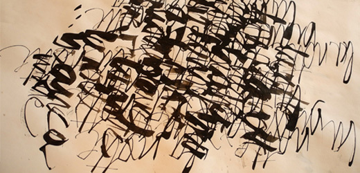
In this course we will develop written forms from real and imagined objects and from the sounds of voices and languages. We will also do a visual study of Oriental calligraphy. In the end all our studies will be standardized and reduced to recognizable alphabetical forms. All the works and the final alphabet will be assembled in a book.
Printing and technology related to the design of typefaces have developed in the West and then in the globalized world. Typography has an ideological and symbolic role whose vast use has reduced, or sometimes completely erased, other registration modes of symbols and ideas, including writings from other cultures and our own handwriting. In general we can say that reducing writing systems to typographic writing systems is a form of colonization. The Western calligraphic tradition is directly and logically linked to typography.
A respectful observation of other writing systems reveals other evolutions, other relationships between form and content, writer and writing, body gesture and trait.
This is not the place to go into such a vast topic, but we can do exercises and games to help us guess the limits of typography.
